
For L.A.’s newest underground art experience, head down to the Metro Regional Connector
Los Angeles Times / Jun 17, 2023 / by Deborah Rankin / Go to Original
For your next art outing, head underground.
The Los Angeles Metropolitan Transportation Authority debuted its Regional Connector Transit Project yesterday, a $1.8 billion undertaking that’s been more than a decade in the making. It includes three new downtown L.A. subway stations — the Grand Ave. Arts/Bunker Hill, Historic Broadway and Little Tokyo/Arts District stops — and each are filled with ambitious new works of art.
Eight artists were commissioned by Metro Art to create permanent, site-specific installations for the stations: Andrea Bowers, Clare Rojas, Audrey Chan, Mark Steven Greenfield, Ann Hamilton, Clarence Williams, Mungo Thomson and Pearl C. Hsiung. There are also two wall-mounted light box installations in the Broadway and Grand Avenue stations, part of a rotating art program. The inaugural artists for those spaces are Ralph Gilbert and Samira Yamin.
“These are significant pieces, by established artists, that are integrated into the overall architecture of the project but also will attract people on their own,” says Metro Art program Senior Director Zipporah Yamamoto. “People will stop and look at these artworks. It’s a major part of the transit experience — and the Los Angeles experience. It extends the downtown L.A. arts and culture experience into the station.”
Artists were chosen through an open competition — more than 1,200 people applied and arts professionals, both independent and from local cultural organizations such as the Broad museum and MOCA, judged the selection process. Artists were paid between $35,000 and $95,000, depending on the scale of their work, for projects produced over a seven-year period. Additional funds went toward the fabrication and installation of the artworks.
The Regional Connector makes it possible to ride direct from Azusa to Long Beach and East L.A. to Santa Monica. Viewing these underground art museums will cost you $1.75 (a subway ticket). The works on the subway platforms, in the station concourses and by the street-level entrances are large-scale and with strong points of view, some vibrant with color and others more muted or monochromatic. They’re made from durable materials, such as architectural glass or glass mosaics, meant to withstand dust from train wheels, gusts of wind and vibrations from passing trains.
“They require minimal maintenance,” Yamamoto says. “The works hold up and are meant to last.”
A week before the Regional Connector opened to the public, as train operators were conducting test runs and maintenance crews were sweeping and power-washing the subway platforms, The Times got an exclusive hard hat visit to the subway art.
So jump on the bandwagon — er, the Siemens P2000 light rail train car — for a recap.
First stop: Little Tokyo/Arts District Station
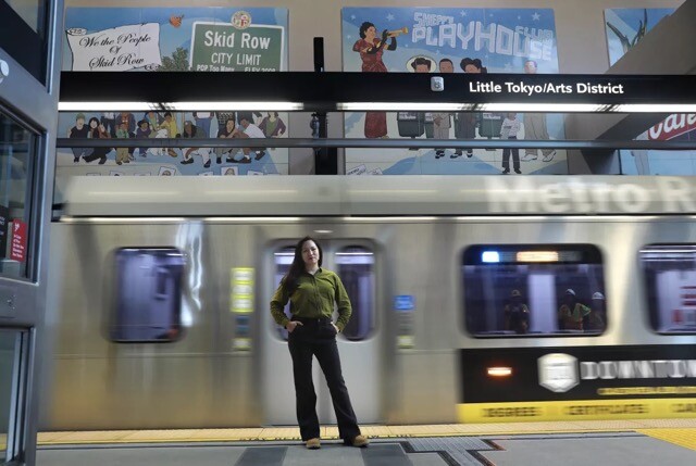
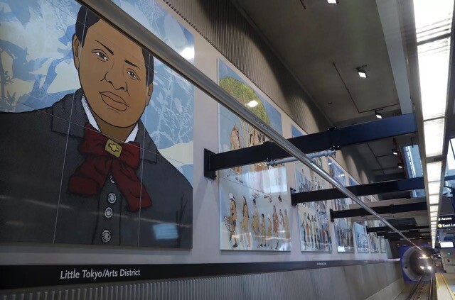
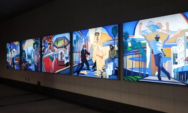
Our tour began at the Little Tokyo/Arts District Station, where Audrey Chan’s 14-panel porcelain enamel and steel mural, “Will Power Allegory,” flanks the tracks on either side of the train platform. The piece — 168 feet long and 14 feet high — presents different vignettes on each panel, populated by real people throughout the decades from city enclaves including Little Tokyo, the Arts District, Skid Row and the former Bronzeville area. Chan conducted three years of community outreach to locate these individuals; some of them are drawn from a Skid Row mural by Danny Park, owner of Skid Row People’s Market. Along the bottom, there’s a continuous procession of Angelenos marching, which binds the panels.
Surveying the work, Chan explains that it’s meant to “challenge historical narratives through allegories of power, place and identity.”
“I’m thinking about the legacy of the WPA and government-funded murals about the American scene,” Chan says. “I’m focusing on the resilience of communities that have been marginalized in so many ways, whether that’s the World War II incarceration of Japanese Americans, the Gabrielino-Tongva Tribe or the Skid Row community which has faced displacement. Also, honoring the Asian American movement, so generations who are fighting to keep places like Little Tokyo alive.”
The work, inspired by Japanese woodblock prints, is intricately layered. It incorporates scans of mulberry bark paper to create a unifying, pulp-like background. Dozens of digital files went into Chan’s design, which a fabricator translated onto porcelain enamel.
Suddenly, a train car arrives and the bottom portion of the artwork is obscured; but larger figures at the top of the work seem to rise above the train. This is strategic, Chan says. Sightlines were a challenge in making the piece, which is surrounded by architectural columns and signage, not to mention moving subway cars. But the work is meant to be interactive and experienced in the round.
“I’m imagining that people going in either direction on the train are joining that procession,” Chan says. “I wanted there to be different allegorical vignettes that you could go in and out of — and you’re as much a spectator as the one being viewed.”
Clare Rojas’ work appears in the station’s entrance pavilion, but because travel is never linear — and our subway car arrives — we move on to the next stop, promising to circle back to Rojas at the end.
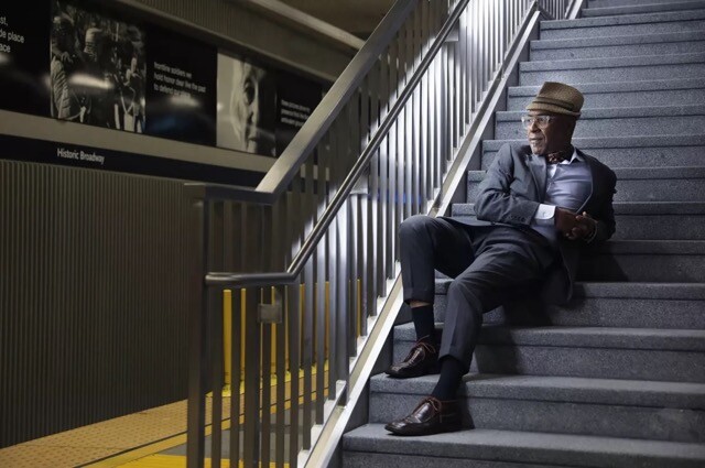
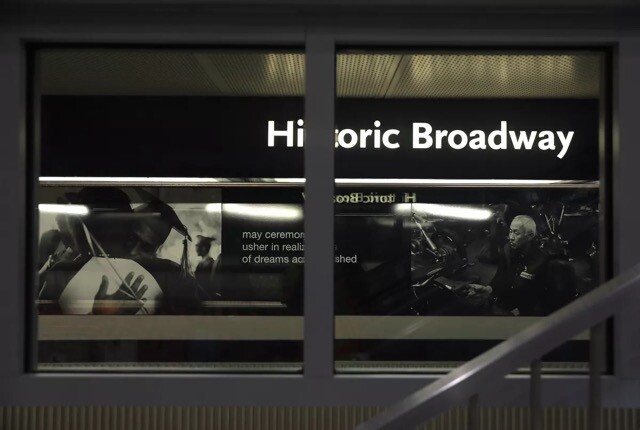
Second stop: Historic Broadway Station
Photographer Clarence Williams’ “Migrations” also flanks the tracks at the Historic Broadway Station. The piece is a black-and-white photo essay, transferred to panels of porcelain enamel steel, addressing Black migration and migration to Los Angeles. One wall displays his images from New Orleans shortly before and after Hurricane Katrina. Williams, a former Los Angeles Times journalist who won the Pulitzer Prize for feature photography in 1998, shot the images after winning an Open Society Foundations fellowship and some of the pictures ran in the Miami Herald.
One photo depicts a narrow boat floating down a flooded street; another shows a despondent-looking, shirtless man bicycling along a wrecked residential street, a weathered American flag whipping in the foreground.
“As a result of the hurricane, there was this migration of Black folks throughout the United States, including to Los Angeles,” Williams says, gesturing to the work.
His photographs on the other side of the platform depict L.A. residents of different ethnicities that have migrated to the city. There’s an elder Armenian woman, a Korean Jewish baby, a Somalian American student. All of Williams’ images are paired with haiku poems his close childhood friend, the poet and spoken word recording artist Ursula Rucker, wrote for the piece. Beside the floating New Orleans boat, it reads:
“gonna trouble the water make it rise, angry, til it leaves its mark”
One picture notably approaches the essay’s narrative differently: It’s of Williams’ parents, a year before Hurricane Katrina. “The reason why I included it within the idea of migration is because that’s the day my father passed away,” Williams says, his voice heavy with emotion.
Suddenly a safety message blares from an overhead speaker: “The train is arriving. Please stand back on the platform.” A subway car rolls in, largely obscuring Williams’ work. But the burst of movement, as the train car cuts through the tunnel, somehow animates the photo essay, punctuating its ideas about migration to a city that, as Williams puts it, is “the quintessential place for new beginnings.”
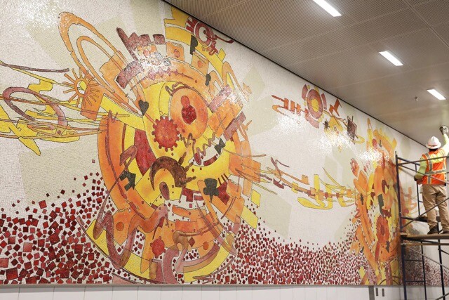
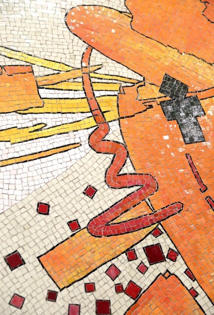
Upstairs, Mark Steven Greenfield’s “Red Car Requiem” mural nearly runs the length of the station concourse. It’s a 148-foot-long glass mosaic piece that took the artist about six years to make. The abstract design, an explosion of red, yellow and orange tones, is an ode to the Pacific Electric Railway Co.’s electric streetcar system — the “red cars” — which debuted in L.A. in 1901, shut down in 1961 and which played an integral role in the development of neighborhoods along its routes.
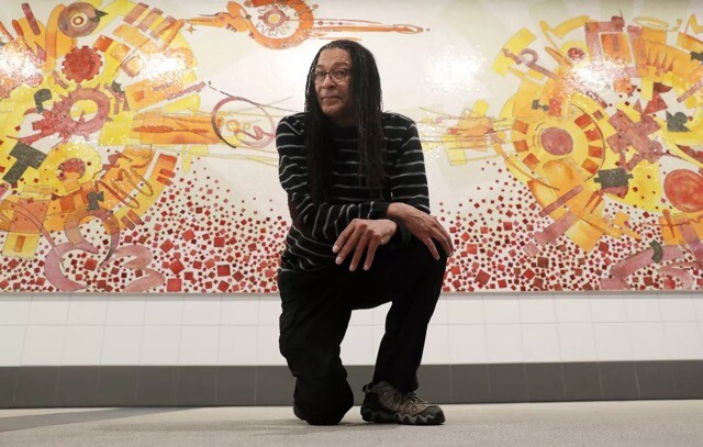
The piece — a series of geometric clusters that the artist describes as “rosettes” and which are linked by kinetic, ribbon-like threads — at first glance looks like a subway map itself. Public transit on the red cars directly informed the piece. In his research, Greenfield spoke to older people with memories of riding the red cars and the circular forms in the rosette clusters are the shape of actual red car ticket punches from his research.
Seeing the work fully installed on-site, Greenfield says he feels “overwhelmed.”
“I was trying to find something that related to the expansion of Los Angeles,” he says. “And if you get into the history of the Pacific Electric, had it not been for that, L.A. wouldn’t have been the sprawl that it is. Because it made different parts of the county accessible.”
Greenfield also appears somewhat astounded that the piece is finally done — and at how well it came out. In designing the work, he painted an exact version at quarter scale, so 2 feet by 37 feet. A fabricator in Mexico translated it to glass mosaic. The painting was done on Dura-Lar (polyester film), he says, and with acrylic ink, “it handles much like watercolor, so you get these subtle gradations. I’m amazed that the fabricators could replicate that effect.”
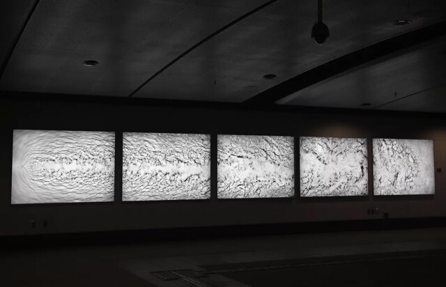
Nearby, on an intermediate landing, Ralph Gilbert’s “Performance on the Streets of LA” fills five light boxes. His images began as paintings of street performers in various locations — along Hollywood Boulevard, Olvera Street/Union Station, at Echo Park Lake, Pershing Square and the Venice Boardwalk — before being digitally transferred to the light boxes. The imagery bleeds from one panel to the next, providing a sense of connectivity. And the bold, primary colors in the works — cobalt blue, lemon yellow, scarlet red — brighten an otherwise benign, utilitarian space connecting staircases.
“My goal with these works,” Gilbert said in a Metro statement, “was to create images that Metro commuters would recognize and relate to as their own world, familiar on the one hand, yet also fresh, as represented by a painter whose character was informed by the city we share.”
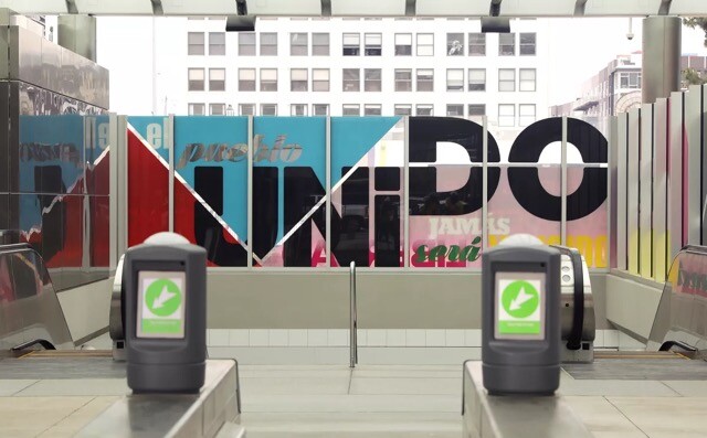
On the plaza level by the station’s entrance is Andrea Bowers’ double-sided text piece on transparent glass. It’s called “The People United (‘El pueblo unido jamás será vencido,’ Sergio Ortega and Quilapayun; ‘Brown Beret 13 Point Political Program,’ La Causa).”
“One of the big technical challenges,” Yamamoto says, “was how to make it readable from both [directions] and not feel like you’re on the wrong side of it.”
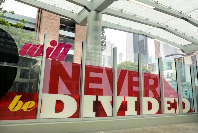
No matter. The graphic and bold text, readable or not, makes a collective point. The station is located directly below the former Los Angeles Times building, in an area thick with civic institutions: City Hall, the Hall of Justice and the U.S. Courthouse, among them. The piece — featuring slogans “El pueblo unido jamás será vencido” (the people united will never be defeated) and “By independence we mean the right to self-determination, self-government and freedom” — conveys the importance of democracy and freedom of expression.
“I seek to reflect the diverse communities,” Bowers said in a statement, “that regularly gather downtown to express their voices and their rights.”
Third Stop: Grand Ave. Arts/Bunker Hill Station
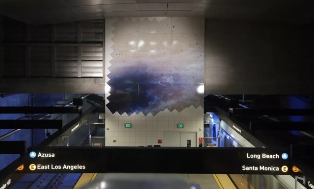
The Grand Ave. Arts/Bunker Hill Station is one of Metro’s deepest. Mungo Thomson wanted to make a connection between tunneling and going deep into the cosmos. As such, he reassembled images from NASA’s Hubble Space Telescope for “Negative Space (STScI-2015-02)” — 7,398 exposures, to be exact, of the Andromeda (M31) galaxy, which he sourced from the telescope’s online archive.
The resulting two square murals — porcelain enamel steel that’s milky white, foggy gray and speckled with bits of midnight blue and rust — are positioned so high up on the station platform walls, between the tracks, that they’re also visible from the upstairs concourse, looking down.
“My work,” Thomson said in a statement, “is broadly interested in backgrounds and in all the contextual information that we tune out and ignore but that nonetheless shapes perception.”
Nearby, another series of light box works appears on the station’s concourse, this installation by Samira Yamin. “All Is Flux” is particularly abstract and fluid-looking, an inky black and pearly white photogram depicting a stream of water flowing across still water in a tray. Its surface is shimmery, its shadows crinkly. The piece appears to glow brighter as the viewer backs away from it.
The artist set out to capture the idea of moving from a state of controlled chaos to more random chaos. Think: water rushing through a narrow pipe versus milk swirling and spreading throughout hot coffee. That “fluid dynamic,” as Yamin says in her artist statement, mimics transit riders dispersing throughout a station and into the world.
“Through the concept of fluid dynamics, I see a direct connection between the planning and engineering of all the various aspects of our cities, and the subjects they serve,” she says. “The very same natural laws used to calculate the shapes of tunnels and trains are embodied in the lived experiences of the ridership, as individuals and as a whole.”
Ann Hamilton’s “over-under-over” appears throughout the station’s two-story glass entry pavilion. Her hand-drawn scrim of blue lines, enlarged and transferred to transparent film, coats the area’s glass surfaces, including the elevator panels. The weave-like design, which conjures fabric, speaks to the interconnected subway lines as well as the cross-section of travelers’ paths from different regions.
“Each line of the Metro system is one thread in the weave that holds the larger system together,” Hamilton said in a statement. “In this part-to-whole relationship, a piece of cloth similarly derives its strength when each thread does its part.”
Riding up in the elevator, the blue lines rush by in a blur. “It’s a very different experience,” Yamamoto says, “when you’re riding in the artwork and when you’re outside, looking at it. You become part of it when you’re on the elevator.”
Pearl C. Hsiung’s monumental “High Prismatic,” in the station’s concourse, is a showstopper. The vertical hand-cut glass mosaic of an erupting geyser under a full moon, with its warm earth tones and deep jewel tones stretching 61 feet high, references geologic, anthropologic and cultural change over thousands of years on, specifically, Bunker Hill.
“Oh my gosh … wow,” Hsiung says, arriving on-site. She’s seeing the work without scaffolding for the first time. “Holy moly.”
Hsiung used multiple paint techniques in the original painting, including sumi ink, watercolor and oil-based enamel sign paint. A team of artisans in Mexico worked for several years to create, cut and assemble glass tiles matching the design before it was installed.
The research process was as labor intensive, says Hsiung, who spent years investigating the history of the Bunker Hill area, which she says “used to be a steep geologic dome.”
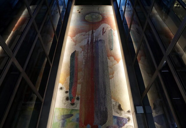
“What is the story of the land that this is on?” Hsiung says. “Through the transformations of this space, this place, from ancient geological time to the more modern era of human inhabitants to a more recent modern era, so much has happened to this mound to make it inhabitable. I’m interested in all those stories that overlap in this one particular section where the station is sitting.”
As Hsiung poses for photos with the mural behind her, she can’t hold back her tears. They stream down her face and she wipes them away with her shirt sleeve.
“When I think of all the human bodies that are moving through the subway station once it’s operational,” she says after the photo shoot, “somehow elements of our ecology — change and movement, that which is visible above ground, also underground — it just feeds into this whole idea for me.”
Fourth stop: Back to Little Tokyo
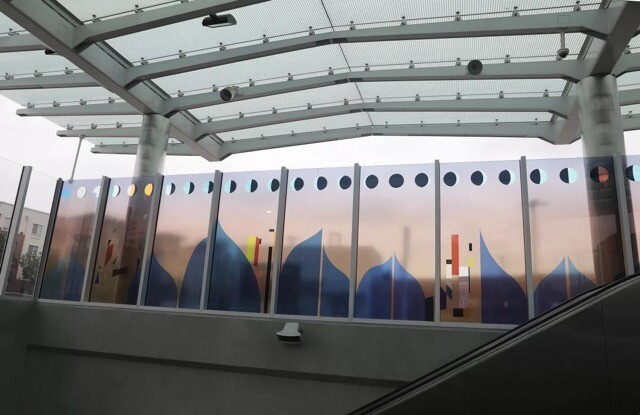
Clare Rojas’ “Harmony” is an uplifting note to end on. Her mix of abstract and figurative symbols on transparent film sandwiched between panes of clear glass, speak to nature commingling with urban life. The colorful work, with iridescent elements, is composed of four sets of transparent panels — two sets on either side of the pavilion — that can be seen from both inside and outside the station.
The work will look differently depending on the time of day and it will project colorful shadows onto the sidewalk outside.
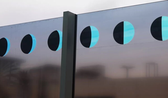
“It’s referencing the city and architectural elements,” Yamamoto says. “The L.A. Aqueduct, the phases of the moon, nature and infrastructural elements combined together.”
While “Harmony” is very much an architecturally inspired work, it also honors the natural landscape.
“The landscape is the great equalizer of humanity,” Rojas said in a statement. “Our cultural traditions are deeply shaped by the earth’s [daily] rotation around the sun, lunar tides, sunrise and sunset.”
Metro expects that by 2035 the Regional Connector will be accommodating 90,000 transit trips daily. Is the organization worried about art works being vandalized or or accidentally harmed by passersby?
Not at all, says Yamamoto. The works were strategically positioned. In areas where passengers linger, such as on the train platforms, the works are out of reach. That’s called “out of the touch zone.” In higher-traffic areas, such as “pass throughs” on concourse levels, the works may be positioned lower, and closer, but they’re less at risk because crowds will be rushing by on their way to catching trains.
“We’ve thought it through carefully,” Yamamoto says. “We want the work to look fantastic throughout its lifetime, as good as it did on the day the project opened.”
Photography by Evelyn Hofer, sculptures by Simone Leigh, and more are among this summer’s must-see exhibitions
The Architect’s Newspaper
May 15, 2023
May 15, 2023
Obscuring and Revealing: Janet Dees and Bethany Collins in Conversation at Auburn Forum for Southern Art and Culture
Stories From The Block
Feb 13, 2024
Feb 13, 2024
Resilient Currents, on communal re-existence. Comisionada por Thanks for Nothing
ArtNexus
Apr 19, 2024
Apr 19, 2024
Cultbytes Power List: Who to Keep an Eye on in 2025
Cultbytes
Jan 4, 2025
Jan 4, 2025
Samuel Levi Jones
4Columns
Jun 16, 2023
Jun 16, 2023
What to See in N.Y.C. Galleries in August and Early September
The New York Times
Aug 30, 2023
Aug 30, 2023