Review: Mika Horibuchi’s Showcase at Patron Gallery
Sixty Inches From Center / Jun 23, 2023 / by Thomas Huston / Go to Original
Viewing Mika Horibuchi’s trompe l’oeil paintings is something like watching a magician perform a sleight of hand. The pleasure comes from knowing this is not real magic while allowing ourselves to be deceived nonetheless. We know the coin has not actually disappeared, that it has only changed location, but how?
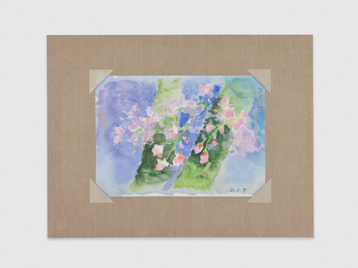
Image: Mika Horibuchi, A Watercolor of Weeping Cherry Branches, 2023. A watercolor painting of pink weeping cherry blossoms draped in front of two green trunks and a pale blue background is surrounded by raw linen. Image credit: Patron Gallery, Chicago / Photographer Evan Jenkins.
“‘I know…’ may mean ‘I do not doubt…’ but does not mean that the words ‘I doubt…’ are senseless, that doubt is logically excluded.”
By way of an introduction, this is an essay about trickery, fraud, and lies.1 Or, should I say, this is an essay about Mika Horibuchi’s exhibition Showcase at Patron Gallery. The important distinction to make when you’re talking about the genuine quality of a painting is not so much whether it is a real painting or a fake; it is whether it is a good fake or a bad fake.
Horibuchi’s paintings are quite traditional. They often employ trompe l’oeil as a conceptual framework, or fall within the lineage of copying the work of “the masters” in order to attain their technical prowess. In interviews, the artist has spoken about her appreciation for the act of reproduction:
I wouldn’t say that I was necessarily a very creative or imaginative kid, I was better at making than playing—making accessories to a game or backdrops to a narrative, or copying images. I made a game out of translating languages and images. I liked the set of instructions that copying something entailed and the labor that was required to fulfill the act.
Since 2017, Horibuchi has turned her interest towards the amateur watercolor paintings of her maternal grandmother, Sayoko Yokoyama, who lives in the Hiroshima prefecture of Japan. Upon completing a watercolor, her grandmother takes a photo of the painting with a point and shoot camera, and then mails the print to Horibuchi in Chicago. Despite titles like Watercolor of Weeping Cherry Branches, Ink Painting of Tulips, and even a 2017 exhibition titled Paintings of Watercolors Horibuchi’s paintings are not of her grandmother’s watercolors. In a sly move, the artist is actually copying the 4×6-inch glossy photos of her grandmother’s watercolors, sent to the artist through the mail. Reproduction is front and center in Horibuchi’s exhibition Showcase at Patron Gallery.
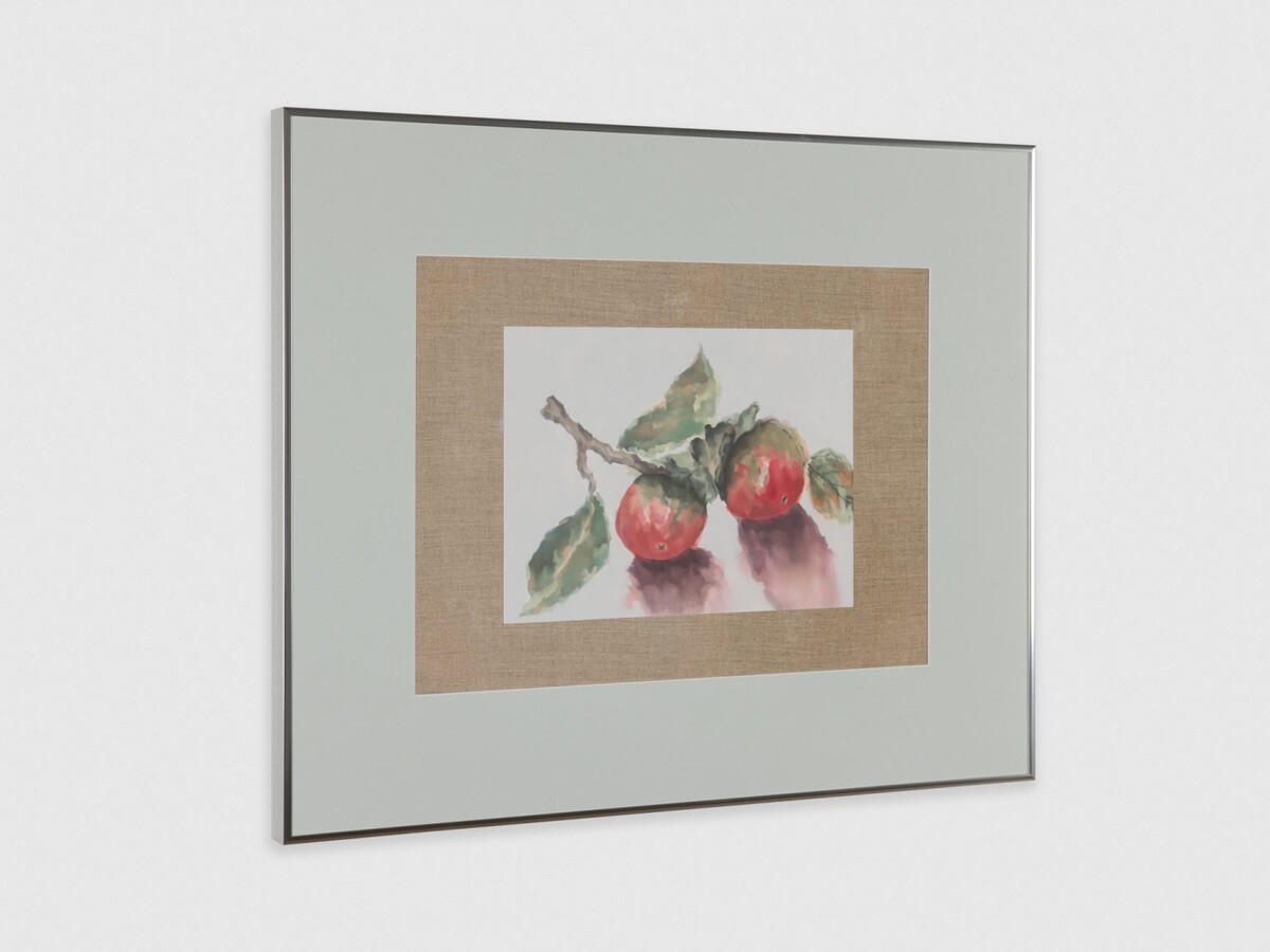
Image: Mika Horibuchi, Persimmons in Watercolor, 2023. A watercolor painting of two pale-red and green persimmons attached to a small branch is surrounded by raw line and wide, sage-gray border. Image courtesy of Patron Gallery. Photographer Evan Jenkins.
The earliest of Horibuchi’s paintings of watercolors, from 2017, were painted at a 1:1 scale to the photographic source material. Raw linen surrounds the 4 x 6 images, and 4 beige corners (trompe l’oeil effects created with layers and layers of painted gesso) hold the image against the canvas as if they were lovingly placed in a scrapbook. However, in “Showcase,” none of the paintings of watercolors are painted at this true-to-life scale. The two largest paintings in the show, Ink Painting of Tulips (2023)and Watercolor of Weeping Cherry Branches (2023), measure 42 x 55 x 2 inches each, a scale that could be described as verging on institutional.4
Three other paintings share a wall in the second room and are unified in subject. They depict the same image of persimmons, originally depicted in three different media: Persimmons in Watercolor, Persimmons in Ink, and Persimmons in Colored Pencil (all 2023). Unlike the other paintings of watercolors, these three are framed. Instead of an expanse of linen, the paintings are surrounded by a wide, sage-gray border. The effect is that of a small watercolor floated in colored mat, a display more reminiscent of a Michaels frame job for a community art show than a white cube commercial gallery. These three paintings begin to introduce the question of taste to the exhibition.
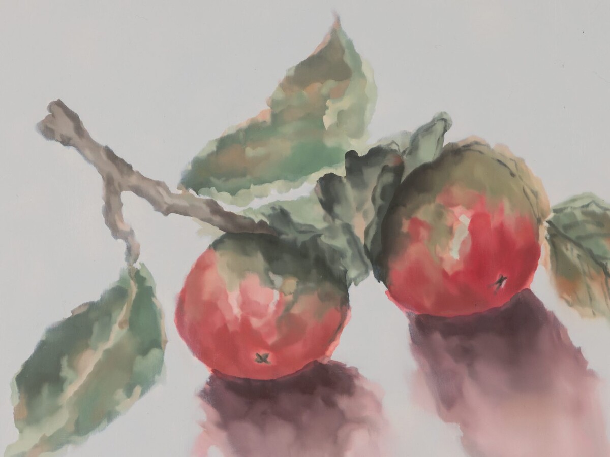
Image: Mika Horibuchi, Persimmons in Watercolor, 2023. A detail image of the watercolor painting of two pale-red and green persimmons attached to a small branch. Image courtesy of Patron Gallery. Photographer Evan Jenkins.
Viewing a trompe l’oeil painting is something like watching a magician perform a sleight of hand. The pleasure comes from knowing this is not real magic while allowing ourselves to be deceived nonetheless. We know the coin has not actually disappeared, that it has only changed location, but how?
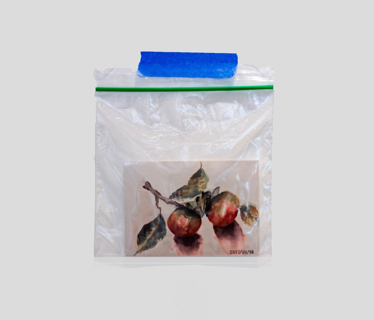
When looking at one of Horibuchi’s enlarged paintings, the artist has already told us this is not a watercolor, despite appearances. The scale of the painting, the media line, the original 4 x 6 photograph in a ziplock baggie taped to the wall to the left of the painting, all tell us what we are not looking at. And yet it is difficult to look at the way the pigments seem to be pooling, the colors mixing just enough for the image to emerge, and not see a watercolor. “There is always a slight sense of jeopardy to the fragility of the outcome,” Horibuchi has said of her painting.
“There is an inherent failure in representational painting, in trying to paint something that exists in the real world with conviction, the thing will never be the thing that it says it is.”5 The gap between our perception and reality is where wonder is produced. It is also the place where our sense of truth begins to shift, erode.
Image: The source material for Horibuchi’s Persimmons in Watercolor, a 4 x 6 photograph of her maternal grandmother Sayoko Yokoyama’s original watercolor, is suspended in a ziplock baggie and taped to the wall. Image courtesy of Patron Gallery. Photographer Evan Jenkins.
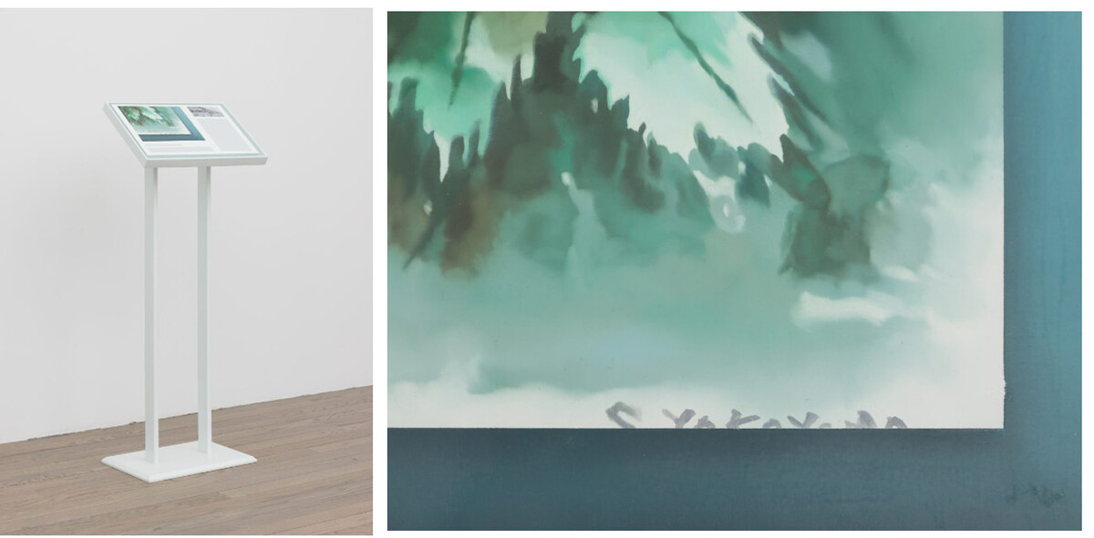
But “Showcase” is not only an exhibition of paintings of watercolors. There is a small painting on a stand (described as a “painted wood stanchion”) in the gallery’s first room. This work is similar to the work Horibuchi produced for a 2020 exhibition at the Driehaus Museum: paintings which appropriate the visual language of museum labels, on stands placed around a room in the historic house museum. In Signed Work by Artist (2023), Horibuchi shifts the reference away from interpretive labels to something more akin to provenance. The painting on the stanchion comprises two cropped, detail images: on the left is a larger image depicting the lower right corner of a watercolor painting bearing a cropped signature. A green border on two sides suggests a colored mat board framing the image. Below are two narrow, horizontal blank rectangles implying redacted text. On the right is a smaller image, in grayscale, depicting Japanese characters6 and a date reading 31 3 77. The two images in this painting, along with the title, suggest a listing in an auction catalog more than a museum label. The details of signature and date imply authenticity and historicity, bringing our attention to the artwork as a commodity backed by its singular original qualities.
Image: Mika Horibuchi, Signed Work by Artist, 2023. A white stanchion sits in a gallery space, displaying two, cropped detail images and two horizontal, blank rectangles. Image courtesy of Patron Gallery. Photographer Evan Jenkins. | Image: A detail image of Horibuchi’s Signed Work by Artist showing a cropped signature against a bluish-green watercolor painting. Image courtesy of Patron Gallery. Photographer Evan Jenkins.
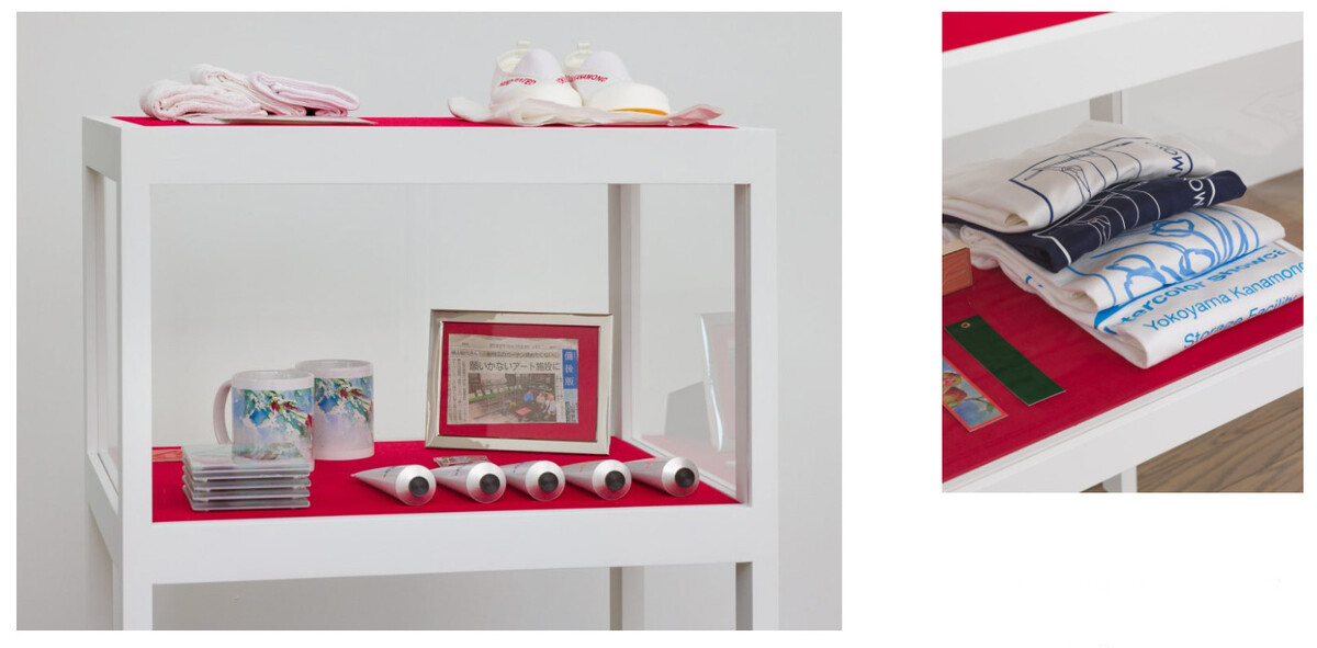
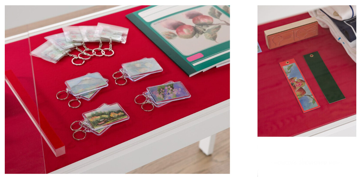
There are three sculptures in “Showcase”: Showcase Vitrine 1, 2, and 3. All three Showcase Vitrines are two-tiered display tables, white with red velvet surfaces. The bottom tier on each table is enclosed with sliding glass panels. The first vitrine displays primarily printed matter—calendars, paper fans, notebooks, and playing cards—along with keychains and a lens cloth, all decorated with reproductions of her grandmother’s watercolors. The second vitrine includes materials and tools of the trade: tubes of paint and studio rags bearing the text “Y Y-K HAND-PAINTED,” along with slip-on shoes with the inscription “HAND PAINTED YOKOYAMA KANAMONO.” Is this a uniform for painting? “Yokoyama Kanamono” roughly translates to “Yokoyama Hardware” or “Yokoyama Equipment.” The third vitrine contains rubber stamps, bookmarks, and t-shirts.
Image: Mika Horibuchi, Showcase Vitrine 2, 2023. A two-tiered, white showcase vitrine with red velvet surfaces displays tubes of paint, branded mugs and coasters, and a pair of inscribed slip-on shoes. Image courtesy of Patron Gallery. Photographer Evan Jenkins. | Image: A detail image of Horibuchi’s Showcase Vitrine 3 featuring four t-shirts that read “Watercolor Showcase Yokoyama Kanamono Storage Facility” folded atop red velvet. Image courtesy of Patron Gallery. Photographer Evan Jenkins.
That t-shirts are among the most covetable merchandise is not news to Horibuchi. She and her partner, artist Dan Rizzo-Orr, have a project together called Sachi Co., which makes “1 off limited runs” of t-shirts and describes itself as a “Bootleg Storage Facility.”8 The project, Horibuchi told me, “analyzes the roles of authorship and ownership, and how we consider what is real, important, successful, fake, fraud, and counterfeit.” One of the t-shirts in Showcase Vitrine 3 reads, “Watercolor Showcase Yokoyama Kanamono Storage Facility.” I wonder, is it available in a size large? How is the desire for art merch different from the desire for art? Does the merchandising of an artwork change the artwork in some way? Does the copying or counterfeiting of an artwork diminish the importance of the original, or reinforce it?
Image: A detail image of Horibuchi’s Showcase Vitrine 1 featuring keychains and notebooks branded with reproductions of Sayoko Yokoyama’s watercolor paintings atop red velvet. Image courtesy of Patron Gallery. Photographer Evan Jenkins. | Image: A detail image of Horibuchi’s Showcase Vitrine 3 featuring an orange rubber stamp bearing two rabbit-duck images and watercolor-branded tags atop red velvet. Image courtesy of Patron Gallery. Photographer Evan Jenkins.
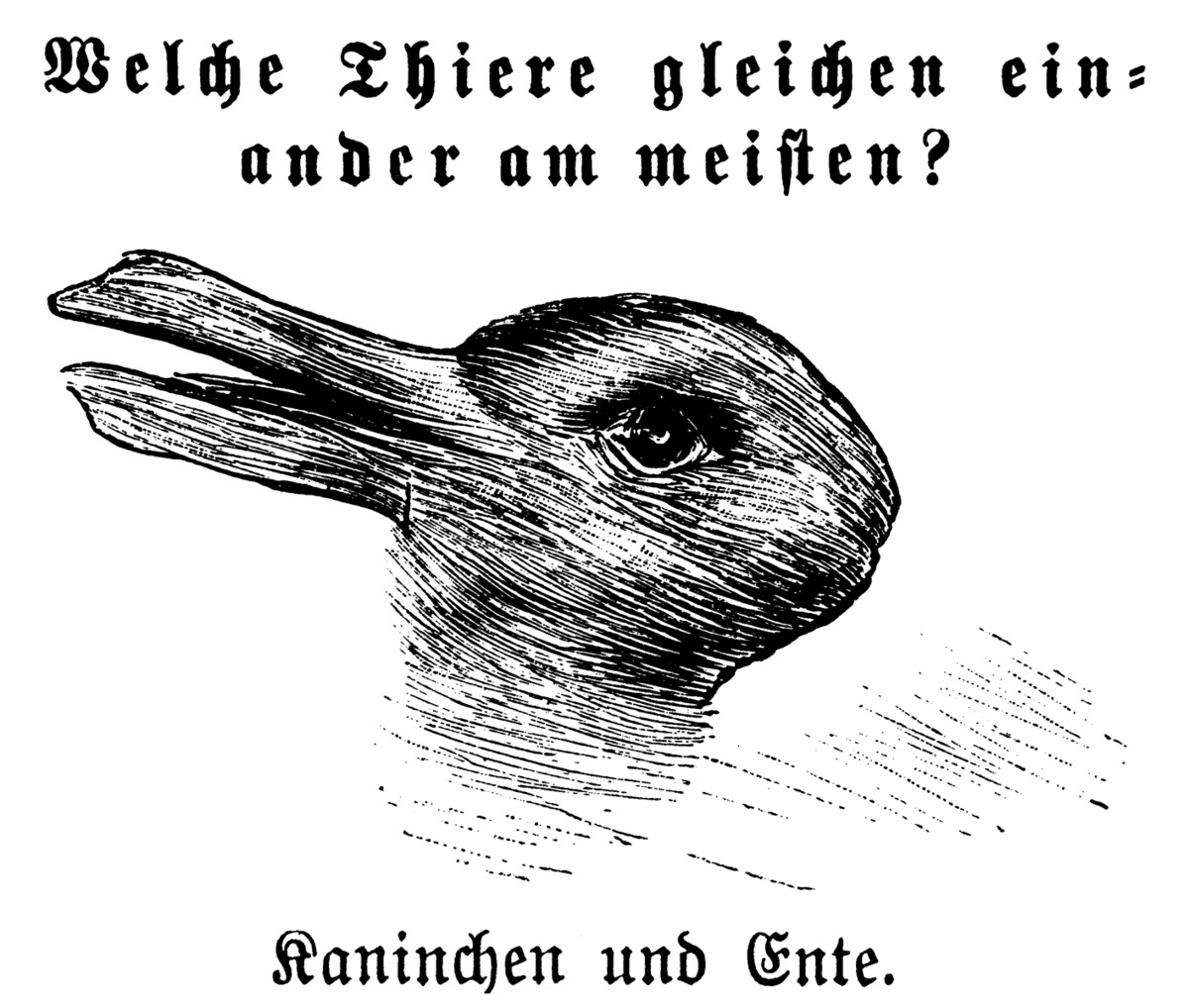
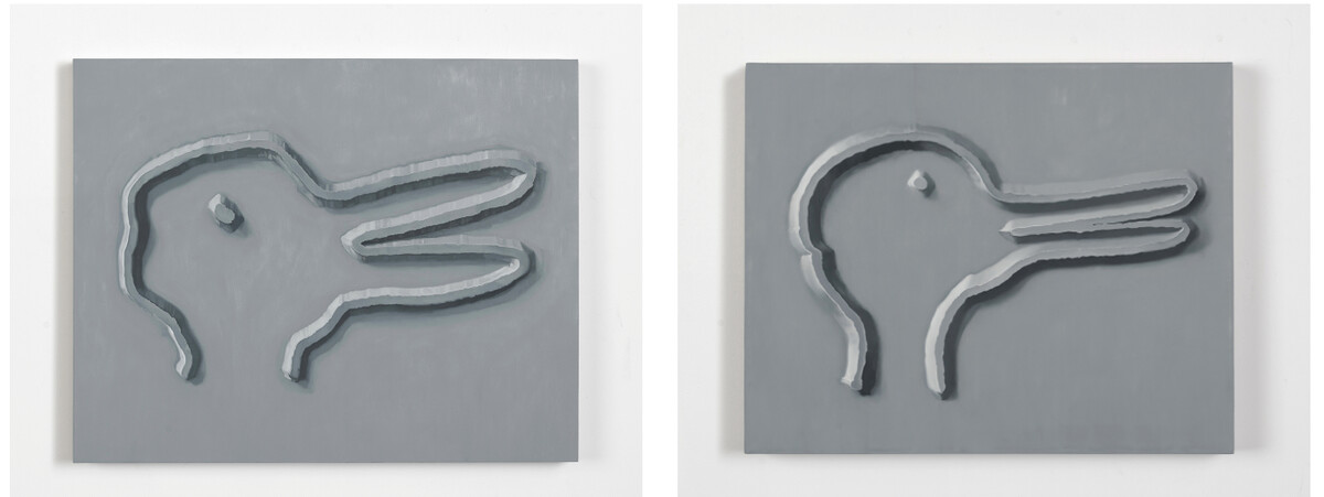
Five paintings in Showcase abandon, to a degree, Horibuchi’s use of trompe l’oeil. These paintings are from a series begun in 2015 and depict variations on the famous rabbit-duck illusion that was first published in 1892 in the German humor magazine Fliegende Blätter. The illustration was accompanied by the question “Which animals are most like each other?” The answer? “Rabbit and Duck.” Each of Horibuchi’s rabbit-duck paintings is rendered in a monochrome gray palette, the illustrations drawn in thick lines with heavy drop shadows, creating the effect of embossing. This embossment suggests a stamp, a crude engraving plate, or some other form of reproducible media. If this is the case, then these are images of the tools of (re)production, once removed from both their source image and their final imprint. On the nearby Showcase Vitrine 3 there is an orange rubber stamp bearing two rabbit-duck images, further reinforcing this reading.
Image: Kaninchen und Ente from the 23 October 1892 issue of Fliegende Blätter. An optical-illusion illustration showing a rabbit-duck and accompanied with a question in German, “Which animals are most like each other?” Image credit: Wikimedia commons
In 1953, Ludwig Wittgenstein used the rabbit-duck to illustrate the ambiguities of perception in his book Philosophical Investigations. The visual illusion offered an opportunity for the Austrian philosopher to break down one’s ability to see both this—as in, “I see a rabbit”—and seeing as, wherein our perception of what we are looking at shifts, and we now see it as a duck. The drawing has not changed, but we have been influenced in some way (by seeing the drawing surrounded by images of ducks perhaps, or by someone else saying, “I see a duck”) to perceive it otherwise:
“The change of aspect. ‘But surely you would say that the picture is altogether different now!’
But what is different: my impression? my point of view?—Can I say? I describe the alteration like a perception; quite as if the object had altered before my eyes.
‘Now I am seeing this’, I might say (pointing to another picture, for example). This has the form of a report of a new perception.
The expression of a change of aspect is the expression of a new perception and at the same time of the perception’s being unchanged.”
All of a sudden, the slipperiness of Horibuchi’s images—not the paintings themselves, but what they contain, translate, represent—suggest a warning. These paintings are not what they say they are, and the stakes are quite high.
Image: Mika Horibuchi, RD MH, 2013. A monochrome gray oil painting of an optical illusion picturing a rabbit-duck. Image courtesy of Patron Gallery. Photographer Evan Jenkins. | Image: Mika Horibuchi, RD LW, 2017. A monochrome gray oil painting of an optical illusion picturing a rabbit-duck. Image courtesy of Patron Gallery. Photographer Evan Jenkins.
Horibuchi’s source material could not be more personal: the loving hobby of a grandmother, shared across an ocean as a form of personal connection. But that love is translated into commodities in the gallery—from the cheap and accessible keychains and rubber stamps (“You can do it, too” she seems to say) to the large scale oil paintings. All that you love, hold dear, is at the risk of recontextualization and commodification. In fact, it probably is already being monetized. You just don’t know it yet.
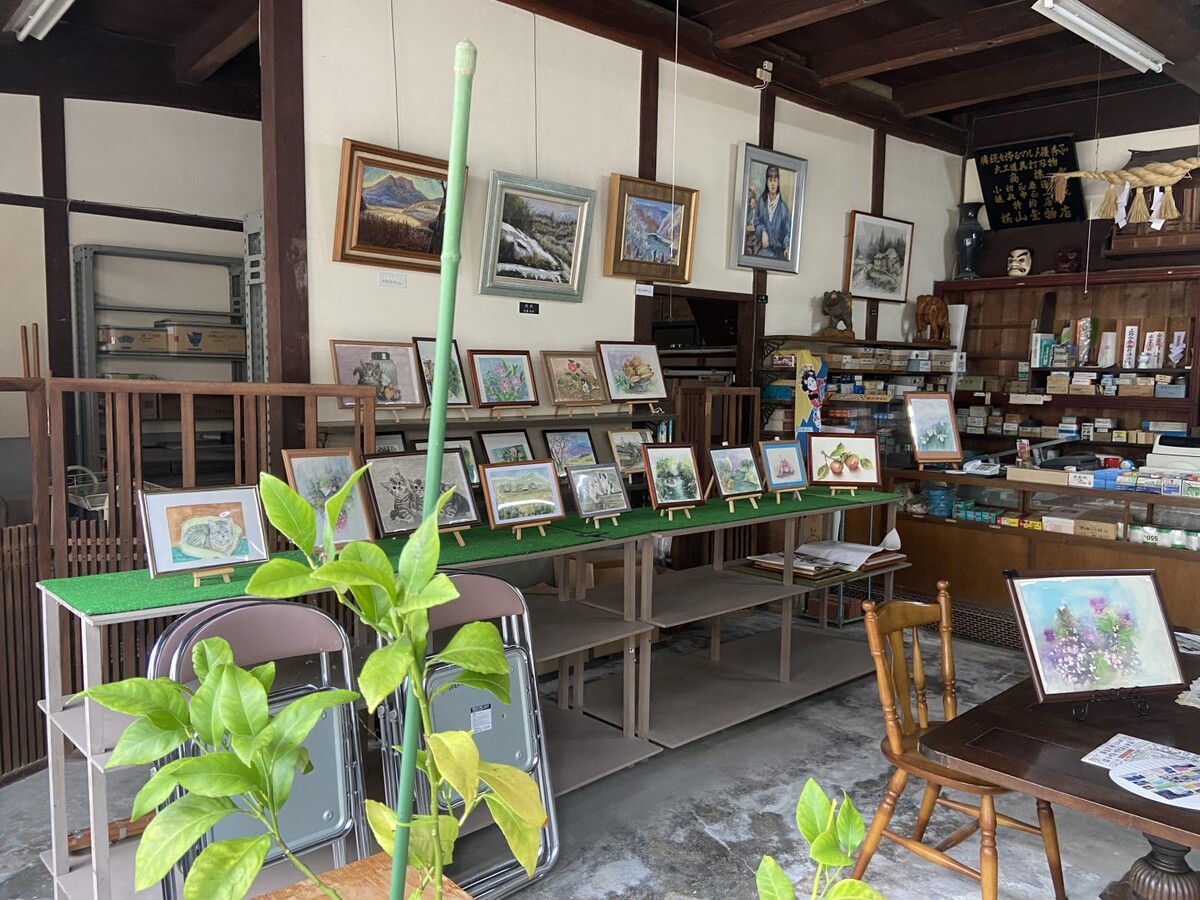
Showcase Vitrines 2 and 3 each display a framed newspaper clipping. On Vintrine 2, the frame is tucked away on the lower shelf, easy to miss. Vitrine 3 displays its newspaper clipping more prominently on top. The Japanese text and small images on each clipping were illegible to me, but I felt that these two innocuous frames might hold some clue to Horibuchi’s undertaking. Responding to my inquiry about the framed clippings, Horibuchi explained that her grandmother had turned their hardware store into an arts space after her grandfather passed away last year. Out front, an A-frame sign proudly declares “Art space Yokoyama.” In an act of both transformation and preservation, the former hardware store now hosts “community art events, workshops, and painting classes.” Instead of commodifying her grandmother’s paintings ad infinitum, the merch that Horibuchi designed serves—as did the copying of her grandmother’s watercolors—to legitimize Art space Yokoyama. Transcending the reproduction, the copy takes on an aura of its own, radiating into the world. This is the pleasure of a good sleight of hand, of a good fake.
Image: Art space Yokoyama in Japan’s Hiroshima prefecture. Paintings are presented on utility shelves, walls, and other surfaces in a former hardware store. Art supplies crowd the old checkout counter. Image courtesy of the artist.
Asking whether it is a duck or a rabbit is not the question that needs asking. The question is why do we see it as one or the other? What are the circumstances that allow us to see it as duck or as rabbit? What happens when we accept that it does not matter as much what it is but how we see it, how we are shown it? There is the possibility for truth in even the most ambiguous and contradictory of statements. Ultimately, the artist must know the manner by which to convince others of the truthfulness of her lies. Horibuchi does.