
Review: Myra Greene racializes the body in beautiful, profound textiles at MOCA GA
ARTS ATL / Sep 27, 2019 / by TK Smith / Go to Original
The work alone is illegible, and that may be the point.
If you’re familiar with Atlanta artist Myra Greene’s practice, you’ll be prepared for her subtle visual interrogations of such complex subjects as race, identity and the body. Those unfamiliar may find the work in INTERVAL at MOCA GA illegible beyond its beauty. The exhibition, part of the museum’s 2018–19 Working Artist Project, can be seen through November 2.
Greene’s previous work took on the intersections of similar subjects through photography. My White Friends (2007–13) was an anthropological gaze into the performance and presentation of whiteness; the beautiful ones (2000–02), presented photographs of obscured visual identity to be searched for their essence of style, beauty and attitude.
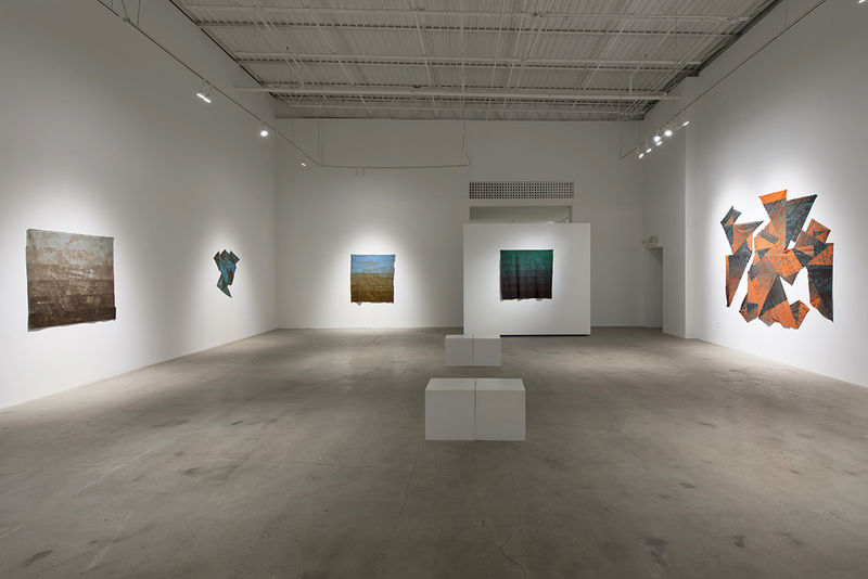
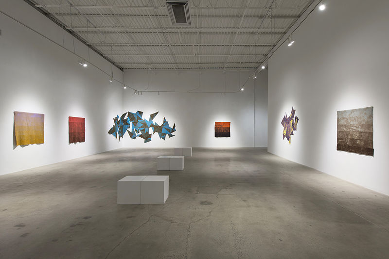
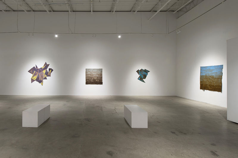
INTERVAL combines two bodies of Greene’s work, Piecework and Mixed. Each piece is firmly within the realm of textile art and abstraction. Each also refers to traditional African and black American textile traditions as well as Greene’s very real and tangible black body.
The four pieces in Piecework appear to crawl and stretch across the gallery walls. They’re mounted in a way that reveals the tension of the seams. Triangular cuts of fabric are sewn together in disjointed tessellations that break from the rectangular expectations of a quilt. The fabrics in each are dyed a dominant familiar color that through tinting, shading and juxtaposition reveals a range of hues ending in rich browns.
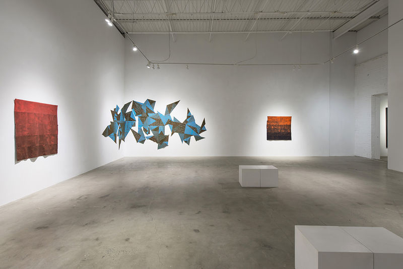
The dyed fabric is covered in silk-screen printed organic forms and patterns that could reference cotton bolls or tire treads. These visually stunning deconstructed quilts fit among the traditional batik dyed fabric of Kano, Nigeria, popularized Dutch wax-print and black American quilts. The triangular shapes may reference the triangular slave trade that made such a creolized textile possible today.
In the six works of the Mixed series, Greene expertly demonstrates her exploration and manipulation of color. These nearly rectangular works are made of strips of dyed fabric stacked and sewn together.
They hang off the walls, moving and curling as you pass by. Just like the Piecework series, these works feature a dominant color that darkens strip by strip.
The dying in these works is exquisite. The colors are so vivid and tactile that you might mistake them for suede or velvet. Through dying and printing techniques, Greene creates depth and emotion. Earthy tones of copper, rose, sage and indigo come to life. Much like the work of abstract expressionist Mark Rothko, the simplicity of form reveals the complexity of Greene’s color use.
Though visually intriguing and undeniably well-crafted, the work falls flat on the walls. Given no text beyond the title wall, each piece lacks context. This leaves the viewer without the framework needed to fully understand and appreciate the layers and complexity of the work, making misinterpretation or disinterest all too possible.
If viewers are unfamiliar with Greene’s practice or don’t take time to read her artistic statement, they may see only the beauty. The work here is disconnected from its significance as the racialized body. But see the pieces as the body and the colors as skin, and you gain a lens into Greene’s form of abstraction that completely shifts how they’re experienced.
There’s something to be said for illegible work, a lack of information and purposeful ignorance. Not all artwork, especially from an artist of color, is meant to be fully understood or enjoyed by all. The exhibition’s description says, “At the center of Greene’s practice is a consideration of how our understanding of color is completely dependent on context — materially, culturally and historically.”
There is a conversation happening here that involves our historical, cultural and social constructions of race and how we have come to view and interact with color because of those constructions. What’s intriguing is how viewers’ experiences might shift when they learn that these bright colors come from brown and refer to various tones of the artist’s skin. Is the work still beautiful? Is it still vivid? Do you still want to touch it?

Alex Chitty + Unison
inUnison
Jan 13, 2015
Jan 13, 2015

Kadar Brock Studio Visit: Hunted Projects
HUNTED PROJECTS | In Dialogue New York
Sep 4, 2013
Sep 4, 2013
Art Incubator
CULTURED Magazine
Sep 22, 2015
Sep 22, 2015

Photographer Interview: Myra Greene
Dodge & Burn blog
Apr 29, 2009
Apr 29, 2009

10 Things To Do in New York's Art World Before July 1
Observer Culture
Jun 28, 2016
Jun 28, 2016
EXPO CHICAGO 2016 Announces Roster for Special Projects Sectors
ARTnews Magazine
Aug 23, 2016
Aug 23, 2016